Ambient Colour and Depth
Visual DesignDepth in a browser viewport is an illusion. The screen is flat. Every element sits on the same physical plane. But the human visual system is remarkably easy to fool with colour, and the techniques that create perceived depth on screen are some of the most useful tools in browser-native scene design.
Ambient colour refers to the overall colour cast of a scene - the background tone, the relationship between foreground and background values, and the way colour temperature shifts across sections. When managed deliberately, ambient colour creates the feeling of spatial depth even in a purely two-dimensional layout.
How colour temperature creates distance
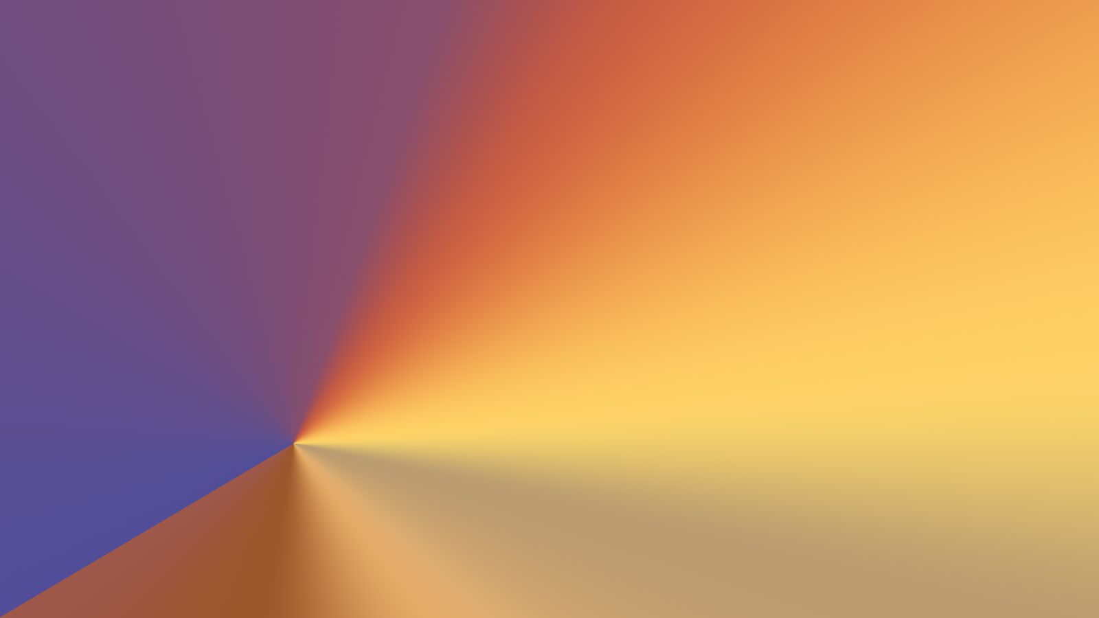
Warm colours - reds, oranges, yellows, and warm neutrals - appear to advance toward the viewer. Cool colours - blues, blue-greys, and cool neutrals - appear to recede. This is not a design convention. It is a perceptual phenomenon rooted in how the human eye focuses different wavelengths of light.
In scene design, this means a warm-toned foreground element against a cool-toned background will feel closer to the viewer than the same element against a warm background. The effect is subtle but measurable. Designers who work with physical materials - painters, set designers, colourists - use this principle constantly. Digital designers often miss it because screen-based colour selection tools do not make temperature relationships explicit.
The practical application is to set background colours slightly cooler than foreground colours. A page with a warm parchment background and warm graphite text has a cohesive tone but limited depth. The same page with a slightly cooler background - shifting the parchment toward grey or adding a hint of blue to the neutral - creates a subtle spatial separation that makes the text feel like it sits in front of the background rather than on it.
Value shifts and atmospheric perspective
Atmospheric perspective is the phenomenon where distant objects appear lighter, lower in contrast, and shifted toward blue. It is caused by the scattering of light through air, and it is one of the strongest depth cues available in landscape painting and photography.
On a web page, atmospheric perspective can be simulated by reducing contrast and shifting colour toward the background tone for elements that should feel recessive. Secondary navigation, metadata, supporting text, and decorative elements can all benefit from this treatment. They remain visible and functional, but they feel like they occupy a different plane than the primary content.
The contrast between primary and recessive elements creates a natural hierarchy that does not rely on size differences or bold weight. A paragraph of body text at full contrast and a caption at 60 percent contrast will feel like they exist at different depths, which is exactly the relationship the content hierarchy intends.
Saturation as proximity cue
Saturation interacts with perceived depth in a similar way to temperature. Highly saturated colours feel closer. Desaturated colours feel further away. This is partly atmospheric perspective again - distant objects are desaturated by the intervening air - and partly attentional, because saturated colours demand more visual processing.
On this site, the accent colours - sand, ember, mulberry - are used at moderate saturation for interactive elements and highlights. The structural colours - graphite, muted greys - are deliberately desaturated. The result is a layered feeling where the interactive surface sits in front of the structural frame.
This does not mean every interactive element should be brightly saturated. Restraint matters. One saturated accent in a field of muted tones draws the eye precisely. Five saturated accents compete with each other and flatten the depth. The ratio between saturated and desaturated area on the page is what creates the perception of layers.
Colour transitions between sections
When a page uses different ambient colours across sections - as the Journey page does - the transitions between those colour states become scene boundaries. The viewer perceives a change in environment, which signals a change in content context.
The transition can be abrupt or gradual. An abrupt colour change creates a hard scene break. A gradual colour change creates a soft transition that feels like moving through a landscape. Both are valid choices depending on the narrative intent.
For gradual transitions, CSS custom properties scoped to each section allow the background colour, text colour, and accent colour to shift independently. The transition happens through the natural scroll movement, creating a colour change that the reader controls without conscious effort.
For abrupt transitions, the contrast between the two colour states should be managed carefully. A jump from dark to light is more disorienting than a jump between two tones of similar value. If a hard boundary is needed between sections with very different colour treatments, a thin divider or a band of neutral colour can soften the perceptual impact.
Practical guidance
Start with a background colour that has a clear temperature. Not pure white, not pure grey, but a toned neutral that establishes the atmospheric baseline. Cool-toned backgrounds create a calm, recessive environment. Warm-toned backgrounds create an intimate, advancing environment.
Set text colour at sufficient contrast for readability, but avoid pure black on any toned background. Pure black against parchment or cream creates a harshness that breaks the atmospheric continuity. A dark graphite or warm near-black maintains readability while keeping the colour relationships coherent.
Use accent colour sparingly and at higher saturation than the structural palette. One accent colour is usually enough. Two can work if they occupy different temperature ranges. Three or more accents flatten the depth hierarchy.
Test colour relationships on multiple screens. The perceived temperature and depth of a colour varies significantly between displays. What looks warmly recessive on a calibrated monitor may look flat on a phone screen. The safest approach is to exaggerate the temperature and value differences slightly beyond what looks perfect on your primary display, knowing that some screens will reduce the effect.