The Journey
This is the flagship piece of A Short Journey. It is a scene-led experience designed for the browser, built with static HTML, careful CSS, and the minimum JavaScript needed to handle progressive interaction. Everything discussed across the rest of this site - motion language, scene transitions, performance discipline - is put into practice here.
The page works without JavaScript. It respects reduced motion preferences. It loads quickly on constrained connections. If your device or preferences strip away the animation layer, what remains is still a complete, readable, well-paced piece.
Arrival
Every journey begins with orientation. The first moments of any browser-native scene set expectations for everything that follows. How fast does this page move? How much control do I have? Is this a place I scroll through, or a place I interact with?
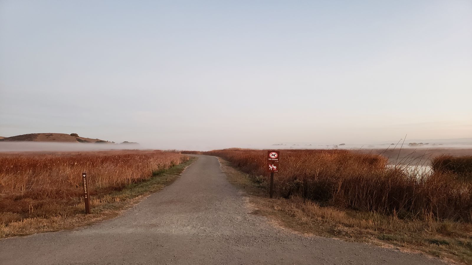
The arrival section answers those questions without explaining them. A slow visual entrance, a clear typographic hierarchy, a sense of space before density. The reader sees the pace before they understand it consciously.
This is where composition matters most. If the opening frame feels cluttered, the visitor decides the whole page will be work. If it feels empty, they wonder whether there is anything here at all. The correct answer is neither. The opening should feel inhabited - present enough to suggest depth, restrained enough to invite movement.
Practically, this means controlling the first viewport carefully. One strong visual element. One clear piece of text. Enough whitespace to signal intention, not abandonment. The scroll indicator, if one exists, should feel like an invitation rather than a command.
On slower devices, the arrival also serves as the loading contract. Whatever appears first must appear fast. A heavy hero image that blocks rendering for three seconds is not an atmospheric opening. It is a blank stare. The images used here are optimised to appear within a single render cycle on mid-range hardware, because the first impression of speed is the first impression of quality.
Terrain
The second movement introduces texture. The reader has agreed to scroll, and now the page rewards that decision with increasing visual complexity. New elements enter. Typographic scale shifts. The relationship between image and text becomes more varied.
This is where most interactive pages lose discipline. The temptation is to escalate - bigger images, more animation, more parallax, more everything. But escalation without purpose is just noise. Each new element in this section earns its place by adding information, changing the rhythm, or reframing what came before.
The terrain section demonstrates what it means to design with a frame budget in mind. Every visual element is measured against what the browser can actually paint within a comfortable rendering window. If a transition would cause a visible stutter on a three-year-old phone, it does not belong here.
Layout shifts are controlled. Images declare their dimensions. Fonts are loaded with strategies that prevent reflow. These are not performance optimisations applied after the fact - they are structural decisions that shaped the section from the first sketch.
The reading pace through this section is deliberately varied. Tighter text blocks alternate with wider visual moments. Short paragraphs punctuate longer passages. The eye moves at different speeds, and that variation keeps attention engaged in a way that uniform density cannot.
Atmosphere
Atmosphere is the quality that separates a page you read from a page you experience. It is not about effects. It is about coherence - the sense that every element belongs, that colour and space and timing are working toward the same feeling.
In this section, the palette and spacing shift subtly. The background tone deepens. Text contrast adjusts. The overall feeling becomes more focused, more intimate. These shifts are handled entirely through CSS custom properties and transition timing, keeping the implementation light and the effect deliberate.
Ambient colour and depth are doing real work here. Not as decoration, but as narrative signal. The page is telling you, through colour alone, that you have moved somewhere new. This is the same principle that film colourists use when shifting palette between acts - except here, the viewer controls the pace.
Sound is intentionally absent in this version. Sound without autoplay is a topic covered in the Notes section, and the reasoning applies here. Audio that starts without consent breaks trust. If a future version adds sound, it will be explicitly opt-in, clearly controllable, and designed to enhance rather than impose.
The atmosphere section also demonstrates how reduced motion handling works in practice. When prefers-reduced-motion is active, the colour transitions still occur, but they happen instantly rather than gradually. The atmosphere is preserved. The animation is not. This distinction matters. Reduced motion does not mean reduced experience. It means the experience adapts to respect the preference without losing its identity.
Transition
Moving between sections is where most immersive web pages stumble. The content inside each section may be carefully designed, but the seams between them often feel arbitrary - a hard cut, a jarring scroll snap, or a transition so elaborate that it draws attention to itself rather than to the content on either side.
This section is about scene transitions as a craft problem. The exit from atmosphere into transition is itself a demonstration. Notice how the spacing changes, how the visual weight redistributes, how the eye is guided from the previous context into the new one without a disorienting jump.
Good transitions are felt, not noticed. They manage continuity - the sense that each section is connected to the one before it and the one after it, even when the visual treatment changes significantly. Typography is one continuity cue. Spacing rhythm is another. Colour relationships, even when the palette shifts, maintain enough connection to prevent the feeling of arriving on a different page.
The practical mechanics here involve careful management of scroll position, layout containment, and paint timing. Each transition boundary is a potential performance cliff. If the browser has to repaint a large area while simultaneously loading new content, the result is a visible stutter that breaks immersion more effectively than any design choice.
Drag, scroll, and tap each create different transition expectations. Scroll transitions are continuous and should feel fluid. Tap transitions are discrete and should feel decisive. Drag transitions are exploratory and should feel responsive. This section uses scroll as its primary mechanism, with tap available as an alternative navigation path through the journey rail.
Horizon
The final section is about endings, which are harder to design well than beginnings. A strong opening creates expectation. A strong ending fulfils it - or deliberately subverts it in a way that feels earned rather than arbitrary.
The horizon section reduces complexity. Elements that appeared earlier are absent. The typographic scale returns to something close to the opening. The pace slows. The visitor is being prepared for the end of the experience, and the page signals that preparation through composition rather than through a label that says “conclusion.”
This is also where internal routing does its most important work. The journey does not end at a dead stop. It resolves into pathways. Making Of is offered as a production companion. Motion Language is suggested for readers interested in the underlying systems. Selected notes provide reference depth for specific topics encountered along the way.
The visitor leaves with orientation. They know where they have been, and they know where they can go next. That sense of resolved navigation - of arriving at the end and finding it opens into something rather than closing into nothing - is the final expression of what scene-based design means on the web.
Building this section well means resisting the urge to add a final spectacle. The temptation is always to end with the biggest gesture. But the strongest endings in interactive storytelling are often the quietest ones. A reduction in scale. A return to simplicity. A clear view of the horizon, with enough detail to suggest that the landscape continues beyond the edge of the frame.
That is what this page attempts. Not a conclusion, but a clearing - a point where the route opens and the choice of direction returns to the person holding the screen.